
Start A Project
heartbound
We would like to share how we arrived at this style and what we want to convey to our clients and audience through visuals.
We'll share the process of creating a logo, choosing fonts, a color palette, and branding graphics.
We'll share the process of creating a logo, choosing fonts, a color palette, and branding graphics.
heartbound creates sophisticated and humane digital solutions for businesses across various industries and people—we are independent of industry specialization, as behind every project is a person and their soul.
Our mission is to bring love and care, responsibility and reliability, innovation, simplicity, and clarity via creating appealing visuals.
Our mission is to bring love and care, responsibility and reliability, innovation, simplicity, and clarity via creating appealing visuals.
About us
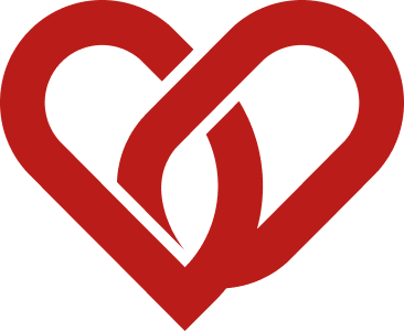
When developing the logo, we initially focused on the meaning of the name itself—a deep connection, an attachment. The visual metaphors were the heart, chains, and links.
Then styles became clear that such weren’t suited to the mood. We needed something easier to perceive, concise, and stable.
Then styles became clear that such weren’t suited to the mood. We needed something easier to perceive, concise, and stable.
Logotype concepts
The symbol is based on two chain links that form the silhouette of a heart.
It evokes the meaning of the word "heartbound," which is used to describe someone who is deeply connected to a loved one—this is how we convey our love for our clients, people who appreciate aesthetics and design.
It evokes the meaning of the word "heartbound," which is used to describe someone who is deeply connected to a loved one—this is how we convey our love for our clients, people who appreciate aesthetics and design.
Logotype
For the logo’s wordmark, we used the TT Ramillas typeface, which conveys sophistication, lightness, and confidence—essential for any brand’s perception.
For the headlines, we chose TT Drugs, which possesses all the qualities of the aforementioned typeface, but also conveys a certain fairytale quality and embraces the current trend for semi-handwritten typefaces.
For the text, we used TT Hoves Pro—a simple, stylish, and easy-to-read typeface, in our opinion.
Fonts
For accent elements in interfaces and graphics, we use red #BA1D19 — not caustic and pleasant for the eye, the font color is dark gray #141 414, the background color is beige #F7F1E8,
Color palette
+
3D elements reflecting the brand’s message are used in various shapes, in a red hue, and were created using Nana Banana AI.
Corporate graphics
The work was completed within 4 weeks.

